Table of Contents
Key Accuracy Metrics for Text Detection: Perplexity, Burstiness, ROC & AUC Explained
Understand perplexity, burstiness, ROC curves, and AUC scores—four key metrics that reveal how AI text detectors judge writing accuracy and reliability.
“Can a Computer Really Tell Who Wrote This?”
Teachers stare at essays, recruiters scan cover letters, editors vet guest posts—and everyone wonders the same thing: Did a human craft these words or did an AI do the heavy lifting? The question feels almost magical, yet the answer boils down to numbers. Behind every text-detection tool is a set of accuracy metrics that quietly judge each sentence. In this post we’ll walk you—step by step—through the four metrics that make or break those judgments: perplexity, burstiness, the ROC curve, and its summary cousin AUC. By the end you’ll know what each term means, why it matters, and how to read a detection report without needing a data-science degree.
Perplexity: Measuring Word-by-Word Surprise
Perplexity is a fancy label for a simple idea: How surprised is a language model by the next word in a sentence? If the words roll out exactly as predicted—“I couldn’t sleep last night”—the model isn’t surprised, so perplexity stays low. When the sequence veers off the obvious path—“I couldn’t sleep last pumpkin”—perplexity shoots up. Think of it like humming a well-known pop tune versus free-form jazz. The pop hook is predictable; jazz riffs keep you guessing. AI-generated text often plays the “pop” melody, choosing high-probability words to sound fluent. Humans sprinkle in odd turns of phrase, jokes, and tiny mistakes, boosting surprise.
Why it matters for detection
-
Low perplexity ⇒ text might be AI-generated (too neat, too safe).
-
Medium perplexity ⇒ ambiguous; needs more signals.
-
High perplexity ⇒ probably human (unless the author is a creative AI told to write unpredictable prose).
No single perplexity score proves anything, but it’s the first clue in the toolbox.
Burstiness: Scanning Sentence Rhythm Where perplexity zooms in on words, burstiness zooms out to sentences. It measures how much your sentence lengths rise and fall—like a heartbeat on a monitor. Human writing usually spikes, rests, and spikes again: “We tried. It failed. Then we tried harder, and everything changed.” Short blast, long breath, short blast. An AI left to its own devices tends to tick like a metronome: sentence, sentence, sentence, all about the same length. Let’s see it:
- Flat version (low burstiness) The launch was delayed. The team investigated the fault. They implemented a fix. The system went online.
- Bursty version (high burstiness) The launch was delayed—again. Frustration? Sure. But after a marathon debugging sprint, the lights finally blinked green and the system roared back to life.
Takeaway:
-
Low burstiness + low perplexity → strong AI signal.
-
High burstiness can override a low perplexity flag and suggest a real human behind the keyboard.
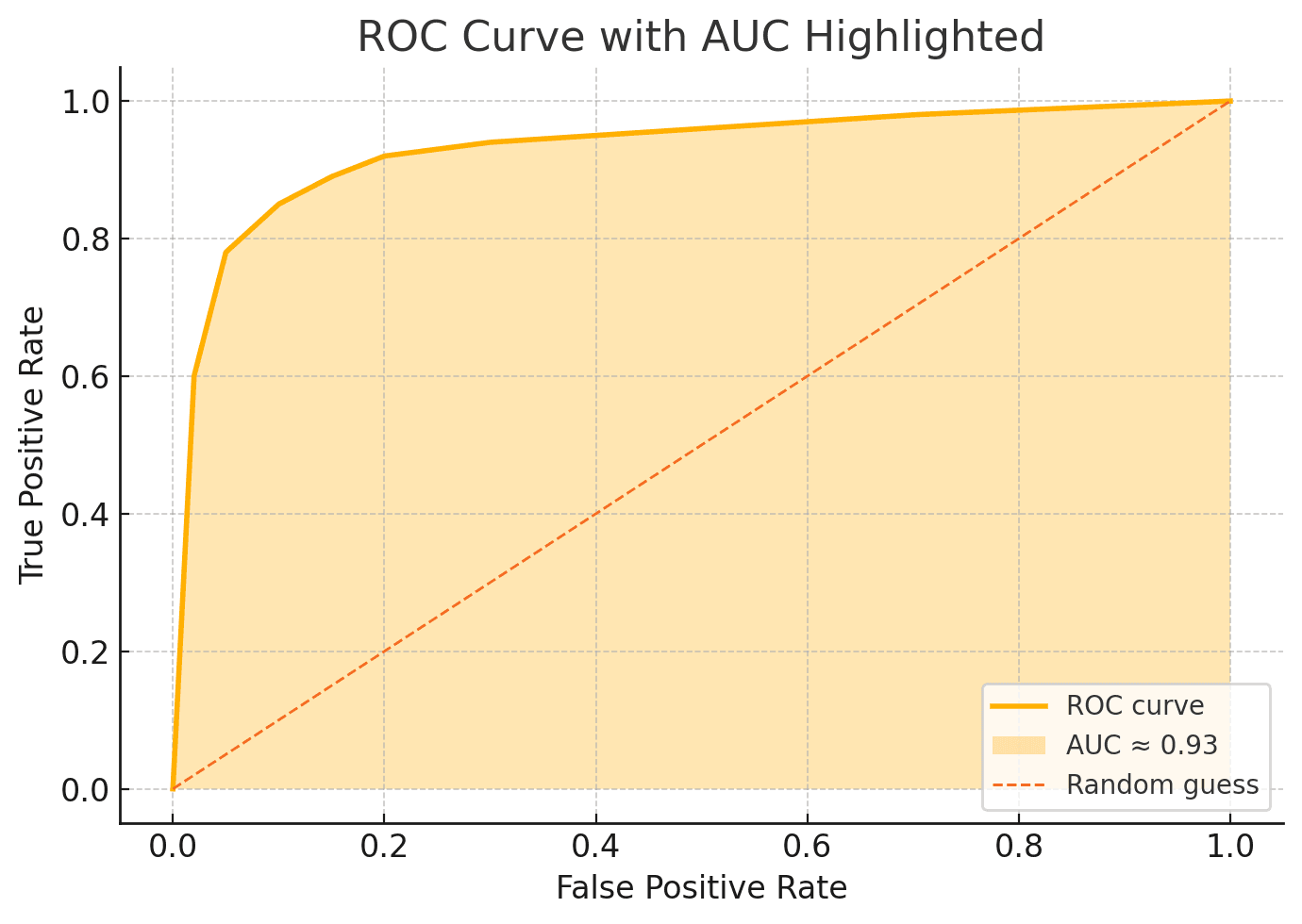
Plotting the ROC Curve: Balancing Hits vs. False Alarms
Perplexity and burstiness tell part of the story, but we still need a way to judge an entire detector, not just one text. Enter the ROC curve—short for Receiver Operating Characteristic. Don’t let the name scare you. Picture a graph where: The X-axis is the False-Positive Rate (how often the tool cries “AI!” when a passage is human).
The Y-axis is the True-Positive Rate (how often it correctly spots AI text).
Now imagine a slider controlling strictness. Slide it left and you catch more AI but also accuse more humans; slide it right and you protect humans but let bots slip by. Every position on the slider becomes a dot on the graph. Connect the dots and you have your ROC curve. A perfect detector hugs the top-left corner—all hits, no false alarms. A useless one slumps along the diagonal line where guessing would do just as well. The closer the curve stays to that coveted corner, the better the detector.
Calculating AUC: Your Detector’s Grade on a Curve
While the ROC curve paints a picture, you don’t always want to eyeball a graph. AUC—Area Under the Curve—shrinks the whole shape into a single number between 0 and 1. 0.5 ≈ coin toss.
0.7 ≈ fair (useful but cautious).
0.9 or above ≈ excellent (rarely fooled).
Think of AUC as a report-card grade for the detector’s overall skill. It averages performance across every possible threshold, so you’re not stuck debating where to set that slider. One caveat: a high AUC doesn’t erase contextual quirks—short texts, creative prompts, or heavy editing can still trip things up. But as a headline metric, AUC tells you whether the detector deserves trust.
Real-World Demo: One Paragraph, Four Metrics
Below is a dummy paragraph run through a hypothetical detector. We’ll list the four metric scores and interpret them like a detective reading clues.
“Digital archives keep expanding, yet knowledge seems to shrink. Maybe it’s the speed: information blinks past before thought can ferment. Slow down, scroll less, and perhaps the web regains its glow.”
Metrics Report
| Metric | Value | Plain Meaning |
|---|---|---|
| Perplexity | 23 | Fairly low—words are predictable. |
| Burstiness | Low | Sentence lengths fairly even. |
| AUC (tool average) | 0.91 | The detector itself is excellent. |
| ROC Snapshot | See chart below | Curve hugs top-left, confirming AUC. |
What the numbers say
Perplexity and burstiness both lean toward an AI fingerprint. Because our detector boasts a high AUC (0.91), we trust its judgment. The ROC curve visually backs that trust: high true-positive rate, low false-positive rate across thresholds. Final verdict for non-experts? Probably AI-generated, with strong confidence.
Conclusion: Layered Metrics Beat Single-Number Claims
You’ve just taken a mini-road trip—from single-word surprise (perplexity) to sentence rhythm (burstiness), passed the sweeping ROC skyline, and landed on the AUC summary. Each stop adds context the others miss. So next time you evaluate a text detector, skim beyond the flashy percentage on the dashboard. Look for tools that publish all four metrics and explain how they’re calculated. Numbers alone don’t guarantee truth, but layered metrics give you the clearest map for spotting machine-made prose in a human world.
Experience the full potential of ChatGPT with Merlin


Hanika Saluja
Hey Reader, Have you met Hanika? 😎 She's the new cool kid on the block, making AI fun and easy to understand. Starting with catchy posts on social media, Hanika now also explores deep topics about tech and AI. When she's not busy writing, you can find her enjoying coffee ☕ in cozy cafes or hanging out with playful cats 🐱 in green parks. Want to see her fun take on tech? Follow her on LinkedIn!